5 Visualisation
A desk is a dangerous place from which to watch the world.1
Good visualisation tells a story, removing the noise from the data and illuminating the useful information. We visualise to present information to a lay audience; it also helps interpretation and discussion within the survey team. Geospatial visualisation is shown on the Maps page.
Diagrams, charts, figures are ubiquitous; do we still notice them? When a diagram is good it can have great influence, as shown in 100 Diagrams That Changed the World (Christianson 2014). Visualisation is the best way of communicating quantitative data and there are many modern examples on how to this; from the ground breaking work of Edward Tufte (Tufte 1983) (Tufte 2020) through to Alan Smith, at the Financial Times, with How Charts Work (Smith 2022). The Royal Statistical Society has published Best Practices for Data Visualisation providing insights, advice, and examples (with code) to make data outputs more readable, accessible, and impactful.Other examples of data visualisation are: Information is Beautiful (McCandless 2012); Data Points - Visualization that means something (Yau 2013); and, Visualize This - The Flowing Data Guide to Design, Visualization, and Statistics (Yau 2011).
5.1 Bat Colours
Colour can enhance visualisation, the choice and combination of colours is important to the communication (Crameri, Shephard, and Heron 2020). A consistent colour applied to individual bat species and a group of colours accessible to people with a visual impairment, helps make the visualisations readable. Unfortunately, accessibility is challenging with more than 8 or 10 colours; if this is the case consider separating the visualisation into different components, creating more than one graph or just highlighting the key species with one colour, with the remaining species shaded as grey.
Table 5.1 lists the set of colours used in the iBats::bat_colours_default function and are used for most of the visualisations on this page. The iBats::bat_colours() function allows any colour to be associated with any bat name (including common names); Section 5.5.2 gives an example chart with common bat names. The colour palett resource provided by coolors lends the ability to create and export a suite of colours; that could be assigned to individual species of bat.
Show the code
bat_colours_sci <- c("Barbastella barbastellus" = "#1f78b4",
                     "Myotis alcathoe" = "#a52a2a",
                     "Myotis bechsteinii" = "#7fff00",
                     "Myotis brandtii" = "#b2df8a",
                     "Myotis mystacinus" = "#6a3d9a",
                     "Myotis nattereri" = "#ff7f00",
                     "Myotis daubentonii" = "#a6cee3",
                      "Myotis spp." = "#bcee68",
                      "Plecotus auritus" = "#8b0000",
                      "Plecotus spp." = "#8b0000",
                      "Plecotus austriacus" = "#000000",
                      "Pipistrellus pipistrellus" = "#ffff99",
                      "Pipistrellus nathusii" = "#8a2be2",
                      "Pipistrellus pygmaeus" = "#b15928",
                      "Pipistrellus spp." = "#fdbf6f",
                      "Rhinolophus ferrumequinum" = "#e31a1c",
                      "Rhinolophus hipposideros" = "#33a02c",
                      "Nyctalus noctula" = "#cab2d6",
                      "Nyctalus leisleri" = "#fb9a99",
                      "Nyctalus spp." = "#eee8cd",
                      "Eptesicus serotinus" = "#008b8b")

bat_colour_table <- tibble(names(bat_colours_sci), unname(bat_colours_sci))

colnames(bat_colour_table) <- c("Scientific Name", "Colour (Hex)")

bat_colour_table %>%
  # Table made with library(flextable)
    flextable(col_keys = colnames(.)) %>%
    bold(part = "header") %>%
    autofit() %>%
    #autofit(add_w = 0.1, add_h = 0.1) %>%
    #bg(bg = "black", part = "header") %>%
    bg(j = 2, i = 1, bg = bat_colour_table$`Colour (Hex)`[1], part = "body") %>%
    bg(j = 2, i = 2, bg = bat_colour_table$`Colour (Hex)`[2], part = "body") %>%
    bg(j = 2, i = 3, bg = bat_colour_table$`Colour (Hex)`[3], part = "body") %>%
    bg(j = 2, i = 4, bg = bat_colour_table$`Colour (Hex)`[4], part = "body") %>%
    bg(j = 2, i = 5, bg = bat_colour_table$`Colour (Hex)`[5], part = "body") %>%
    bg(j = 2, i = 6, bg = bat_colour_table$`Colour (Hex)`[6], part = "body") %>%
    bg(j = 2, i = 7, bg = bat_colour_table$`Colour (Hex)`[7], part = "body") %>%
    bg(j = 2, i = 8, bg = bat_colour_table$`Colour (Hex)`[8], part = "body") %>%
    bg(j = 2, i = 9, bg = bat_colour_table$`Colour (Hex)`[9], part = "body") %>%
    bg(j = 2, i = 10, bg = bat_colour_table$`Colour (Hex)`[10], part = "body") %>%
    bg(j = 2, i = 11, bg = bat_colour_table$`Colour (Hex)`[11], part = "body") %>%
    color(j = 2, i = 11, color = "white", part = "body") %>%
    bg(j = 2, i = 12, bg = bat_colour_table$`Colour (Hex)`[12], part = "body") %>%
    bg(j = 2, i = 13, bg = bat_colour_table$`Colour (Hex)`[13], part = "body") %>%
    bg(j = 2, i = 14, bg = bat_colour_table$`Colour (Hex)`[14], part = "body") %>%
    bg(j = 2, i = 15, bg = bat_colour_table$`Colour (Hex)`[15], part = "body") %>%
    bg(j = 2, i = 16, bg = bat_colour_table$`Colour (Hex)`[16], part = "body") %>%
    bg(j = 2, i = 17, bg = bat_colour_table$`Colour (Hex)`[17], part = "body") %>%
    bg(j = 2, i = 18, bg = bat_colour_table$`Colour (Hex)`[18], part = "body") %>%
    bg(j = 2, i = 19, bg = bat_colour_table$`Colour (Hex)`[19], part = "body") %>%
    bg(j = 2, i = 20, bg = bat_colour_table$`Colour (Hex)`[20], part = "body") %>%
    bg(j = 2, i = 21, bg = bat_colour_table$`Colour (Hex)`[21], part = "body") %>%
   # color(color = "white", part = "header") %>%
    align(align = "center", part = "header" ) %>%
    align(j = 2, align = "right", part = "body") %>%
italic(j = 1, italic = TRUE, part = "body") Scientific Name | Colour (Hex) |
|---|---|
Barbastella barbastellus | #1f78b4 |
Myotis alcathoe | #a52a2a |
Myotis bechsteinii | #7fff00 |
Myotis brandtii | #b2df8a |
Myotis mystacinus | #6a3d9a |
Myotis nattereri | #ff7f00 |
Myotis daubentonii | #a6cee3 |
Myotis spp. | #bcee68 |
Plecotus auritus | #8b0000 |
Plecotus spp. | #8b0000 |
Plecotus austriacus | #000000 |
Pipistrellus pipistrellus | #ffff99 |
Pipistrellus nathusii | #8a2be2 |
Pipistrellus pygmaeus | #b15928 |
Pipistrellus spp. | #fdbf6f |
Rhinolophus ferrumequinum | #e31a1c |
Rhinolophus hipposideros | #33a02c |
Nyctalus noctula | #cab2d6 |
Nyctalus leisleri | #fb9a99 |
Nyctalus spp. | #eee8cd |
Eptesicus serotinus | #008b8b |
5.2 Time Bats Were Active
Figure 5.1 illustrates bat activity through one night near an Oak tree in the River Tavy valley, Devon. Rather than depicting a bat pass the time the bat was present is shown. The y-axis is expanded to spread the bat activity making the graph more readable.
The data used TavyOak is from the iBats package. The bat species colour for the graph were made using the iBats::bat_colours() function; this provided the colour values used by ggplot's manual scale function scale_fill_manual().
Show the code
bat_colours_sci <- c(
  "Barbastella barbastellus" = "#1f78b4",
  "Myotis alcathoe" = "#a52a2a",
  "Myotis bechsteinii" = "#7fff00",
  "Myotis brandtii" = "#b2df8a",
  "Myotis mystacinus" = "#6a3d9a",
  "Myotis nattereri" = "#ff7f00",
  "Myotis daubentonii" = "#a6cee3",
  "Myotis spp." = "#bcee68",
  "Plecotus auritus" = "#8b0000",
  "Plecotus spp." = "#8b0000",
  "Plecotus austriacus" = "#000000",
  "Pipistrellus pipistrellus" = "#ffff99",
  "Pipistrellus nathusii" = "#8a2be2",
  "Pipistrellus pygmaeus" = "#b15928",
  "Pipistrellus spp." = "#fdbf6f",
  "Rhinolophus ferrumequinum" = "#e31a1c",
  "Rhinolophus hipposideros" = "#33a02c",
  "Nyctalus noctula" = "#cab2d6",
  "Nyctalus leisleri" = "#fb9a99",
  "Nyctalus spp." = "#eee8cd",
  "Eptesicus serotinus" = "#008b8b"
)

# graph anotation
graph_sunrise <- TavyOak$sunrise[1]
graph_sunset <- TavyOak$sunset[1]

# graph time limits x-axis
graph_limit1 <- TavyOak$sunset[1] - lubridate::hours(1)
graph_limit2 <- TavyOak$sunrise[1] + lubridate::hours(1)

# colour values used by scale_fill_manual()
graph_bat_colours <- iBats::bat_colours(TavyOak$Species, colour_vector = bat_colours_sci)

ggplot(TavyOak, aes(y = 1, x = DateTime, fill = Species, size = bat_time)) +
  geom_jitter(shape = 21, alpha = 0.7) +
  geom_vline(
    xintercept = graph_sunset,
    colour = "brown1",
    linetype = "dashed",
    linewidth = 1,
    alpha = 0.8
  ) +
  geom_vline(
    xintercept = graph_sunrise,
    colour = "mediumblue",
    linetype = "dashed",
    linewidth = 1,
    alpha = 0.8
  ) +
  annotate("text",
    x = graph_sunset - lubridate::minutes(20),
    y = 1,
    label = "Sunset",
    color = "brown1",
    angle = 270
  ) +
  annotate("text",
    x = graph_sunrise + lubridate::minutes(20),
    y = 1,
    label = "Sunrise",
    color = "mediumblue",
    angle = 270
  ) +
  scale_fill_manual(values = graph_bat_colours) +
  scale_size_area(max_size = 12) +
  scale_x_datetime(
    date_labels = "%H:%M hrs",
    date_breaks = "1 hour",
    limits = c(graph_limit1, graph_limit2)
  ) +
  labs(
    fill = "Species",
    size = "Time Bat Was Present\n(seconds)",
    y = "For clarity activity is spread across the verstical scale"
  ) +
  theme_bw() +
  theme(
    legend.position = "right",
    panel.grid.major.x = element_line(),
    panel.grid.major.y = element_blank(),
    panel.grid.minor = element_blank(),
    axis.text.x = element_text(size = 10, angle = 270),
    axis.text.y = element_blank(),
    axis.ticks.y = element_blank(),
    strip.text = element_text(size = 12, face = "bold", colour = "white"),
    legend.text = element_text(face = "italic"),
    axis.title.x = element_blank(),
    axis.title.y = element_text(size = 10)
  ) +
  #Make the point size larger on the legend to show the colour
  guides(fill = guide_legend(override.aes = list(size=4)))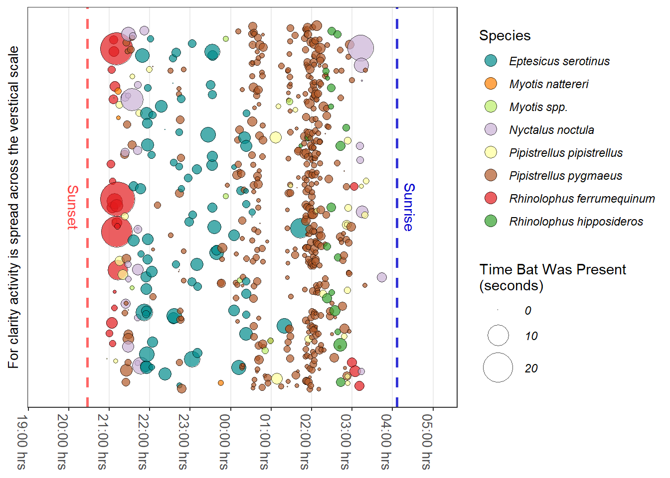
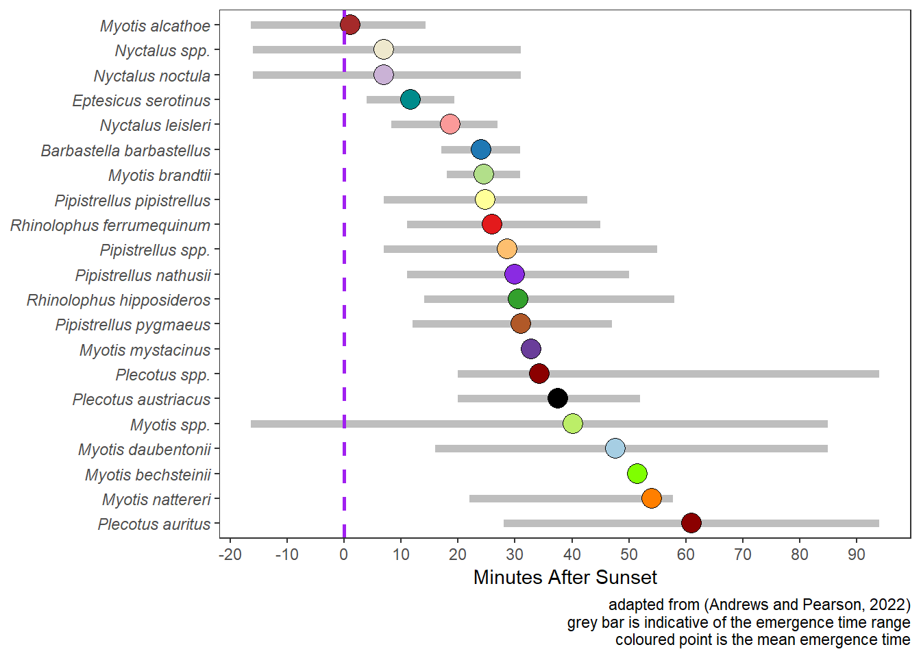
5.3 Emergence Time of Bats
Figure 5.2 illustrates emergence times for UK bats based on the work of (Andrews and Pearson 2022).
Show the code
### Libraries Used
library(tidyverse) # Data Science packages - see https://www.tidyverse.org/

# Install devtools if not installed
# devtools is used to install the iBats package from GitHub
if(!require(devtools)){
  install.packages("devtools")
}

# If iBats not installed load from Github
if(!require(iBats)){
  devtools::install_github("Nattereri/iBats")
}
library(iBats)

# colour values used by scale_fill_manual()
graph_bat_colours <- iBats::bat_colours_default(Andrews$Species)

ggplot(Andrews) +
  geom_segment(aes(x = reorder(Species, -meanExit), xend = Species, y = firstExit95, yend = lastExit95), color = "grey", size = 2) +
  geom_point(aes(x = reorder(Species, -meanExit), y = meanExit, fill = Species), color = "black", size = 5, shape = 21) +
  scale_y_continuous(breaks = c(-20, -10, 0, 10, 20, 30, 40, 50, 60, 70, 80, 90, 100)) +
  geom_hline(yintercept = 0, linetype = "dashed", colour = "purple", size = 1) +
  scale_fill_manual(values = graph_bat_colours) +
  coord_flip() +
  labs(
    y = "Minutes After Sunset",
    caption = "adapted from (Andrews and Pearson, 2022)\ngrey bar is indicative of the emergence time range\ncoloured point is the mean emergence time"
  ) +
  theme_bw() +
  theme(
    legend.position = "none",
    axis.text.y = element_text(face = "italic"),
    axis.title.y = element_blank(),
    panel.grid = element_blank()
  )
5.4 Graphing a Count of Bats
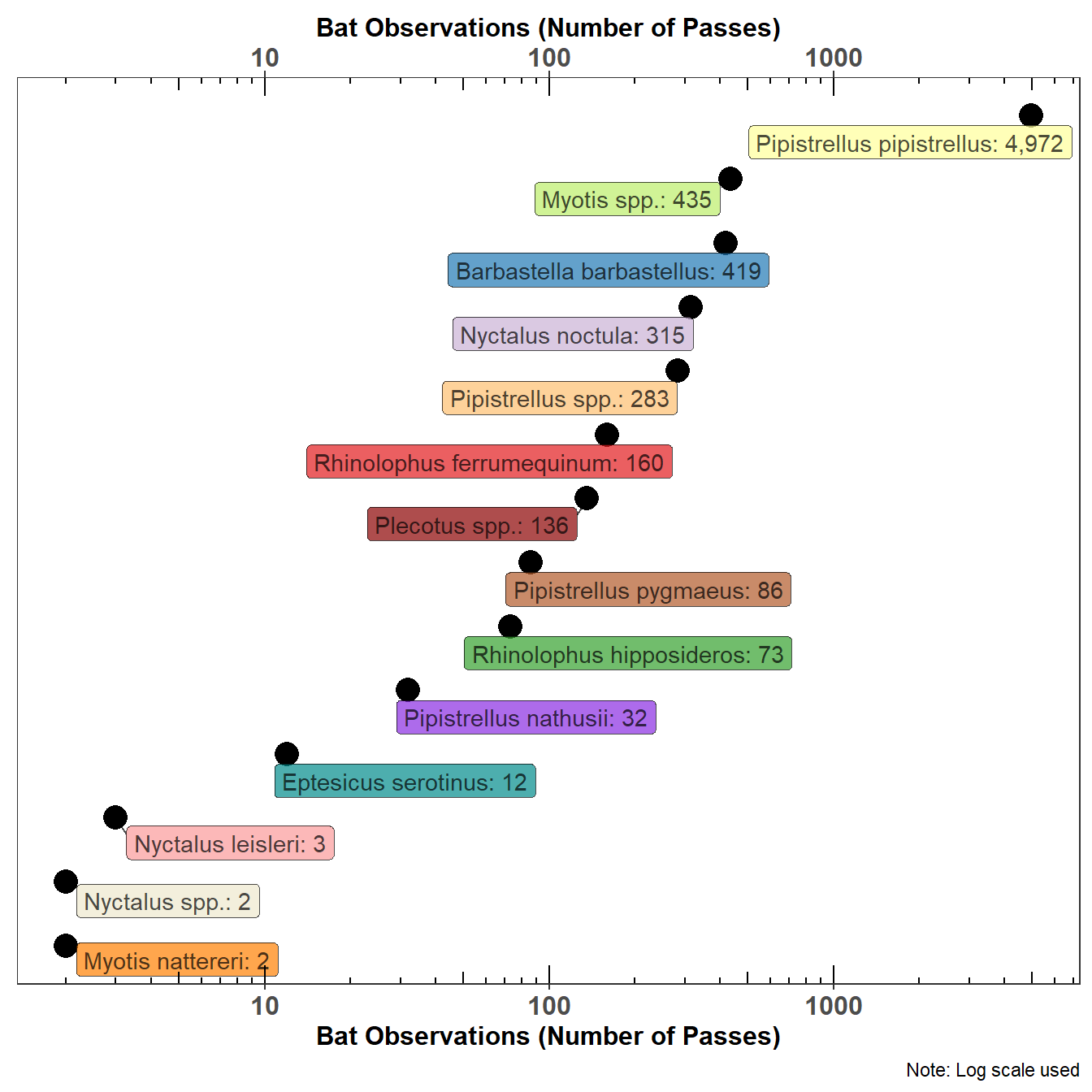
One of the problems with presenting a count of bat passes observed in the UK is the relative abundance of the Common Pipistrelle (Pipistrellus pipistrellus). Figure 5.3 tries to resolve this issue by using a log scale, not a friendly scale to the lay reader but some mitigation is achieved by placing the actual count of bat passes on the graph. Figure 5.3 shows the count of bat species in the statics data.
5.4.1 Dot Graph
Show the code
### Libraries Used
library(tidyverse) # Data Science packages - see https://www.tidyverse.org/
library(broman) # useful add_commas function -
# see https://cran.r-project.org/web/packages/broman/index.html
library(glue) # for joining text and variables
library(ggrepel) # for tidy graph labels


# Install devtools if not installed
# devtools is used to install the iBats package from GitHub
if(!require(devtools)){
  install.packages("devtools")
}

# If iBats not installed load from Github
if(!require(iBats)){
  devtools::install_github("Nattereri/iBats")
}
library(iBats)

graph_data <- statics %>% #statics is a bat survey data set from the iBats package
  group_by(Species) %>%
  count() %>%
  # Add a graph species label; commas added with library(broman)
  mutate(
    total = add_commas(n),
    label = glue("{Species}: {total}")
  )

# colour values used by scale_fill_manual()
graph_bat_colours <- iBats::bat_colours_default(graph_data$Species)


ggplot(graph_data, aes(y = reorder(Species, n), x = n, fill = Species)) +
  geom_point(colour = "black", size = 5) +
  geom_label_repel(
    data = graph_data, aes(label = label),
    nudge_y = -0.25,
    nudge_x = ifelse(graph_data$n < 100, 0.33, -0.33),
    alpha = 0.7
  ) +
  scale_fill_manual(values = graph_bat_colours) +
  scale_x_log10(sec.axis = dup_axis()) +
  annotation_logticks(sides = "tb") +
  labs(
    x = "Bat Observations (Number of Passes)",
    caption = "Note: Log scale used"
  ) +
  theme_bw() +
  theme(
    legend.position = "none",
    panel.grid.major = element_blank(),
    panel.grid.minor = element_blank(),
    axis.text.x = element_text(size = 12, face = "bold"),
    axis.text.y = element_blank(),
    axis.ticks.y = element_blank(),
    strip.text = element_text(size = 12, face = "bold", colour = "white"),
    axis.title.x = element_text(size = 12, face = "bold"),
    axis.title.y = element_blank()
  )
5.4.2 Tree Map Description
Show the code
### Libraries Used
library(tidyverse) # Data Science packages - see https://www.tidyverse.org/
library(treemapify) # extension to ggplot for plotting treemaps -
# see https://cran.r-project.org/web/packages/treemapify/vignettes/introduction-to-treemapify.html

# Install devtools if not installed
# devtools is used to install the iBats package from GitHub
if(!require(devtools)){
  install.packages("devtools")
}

# If iBats not installed load from Github
if(!require(iBats)){
  devtools::install_github("Nattereri/iBats")
}
library(iBats)

graph_data <- statics %>% #statics is a bat survey data set from the iBats package
  group_by(Species, Description) %>%
  tally()

# colour values used by scale_fill_manual()
graph_bat_colours <- iBats::bat_colours_default(graph_data$Species)

ggplot(graph_data, aes(area = n, fill = Species, label = Species, subgroup = Description)) +
  scale_fill_manual(values = graph_bat_colours) +
  geom_treemap(colour = "white", size = 2, alpha = 0.9) +
  geom_treemap_subgroup_border(colour = "black", size = 5, alpha = 0.9) +
  geom_treemap_subgroup_text(
    place = "centre", grow = T, alpha = 0.9, colour =
      "grey20", min.size = 0
  ) +
  geom_treemap_text(
    colour = "grey90", place = "topleft", fontface = "italic",
    reflow = T, min.size = 0, alpha = 0.9
  ) +
  theme_bw() +
  theme(legend.position = "none") # No legend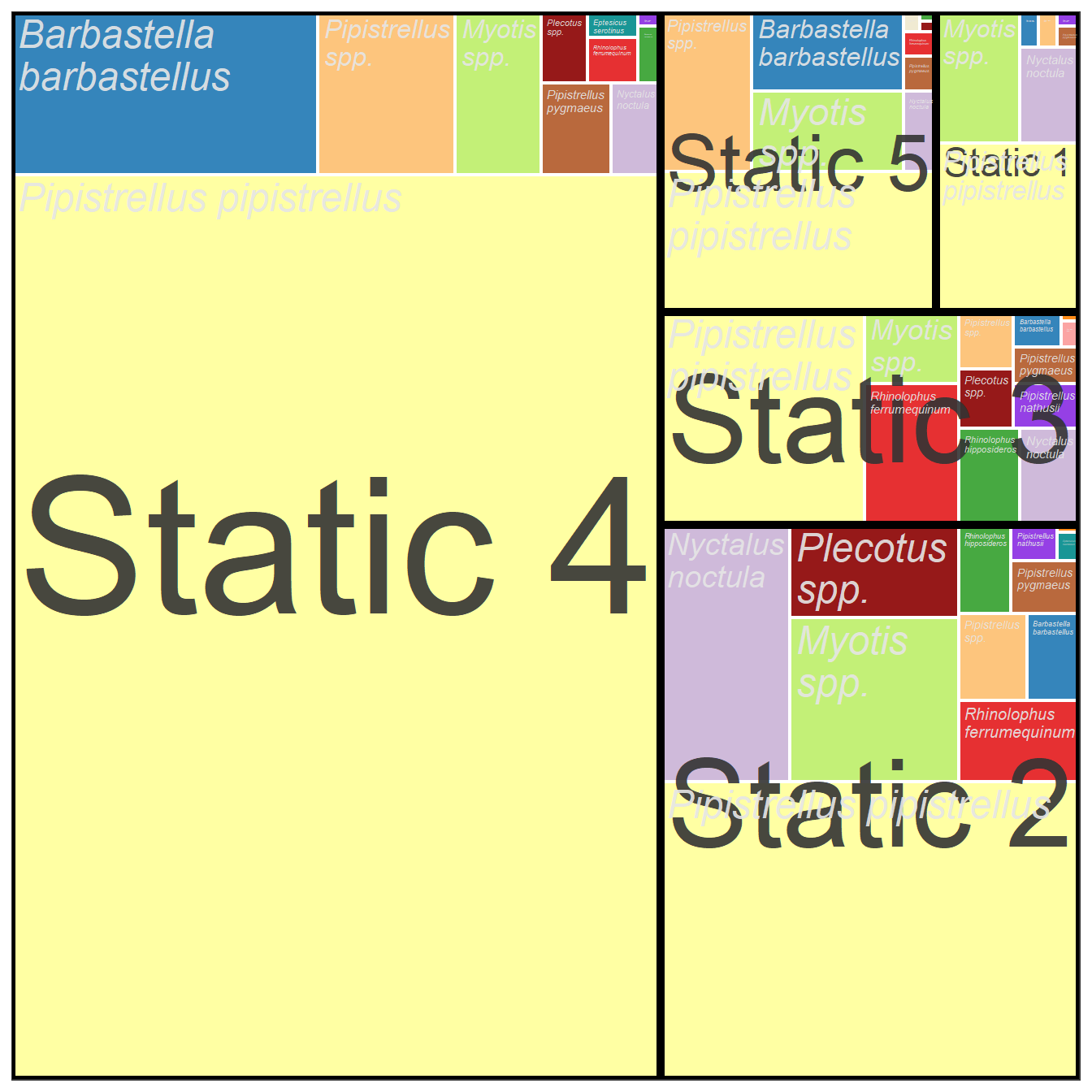
5.4.3 Tree Map Month
Show the code
### Libraries Used
library(tidyverse) # Data Science packages - see https://www.tidyverse.org/
library(treemapify) # extension to ggplot for plotting treemaps -
# see https://cran.r-project.org/web/packages/treemapify/vignettes/introduction-to-treemapify.html
library(ggthemes) # for colour pallet "Tableau 10"

# Install devtools if not installed
# devtools is used to install the iBats package from GitHub
if(!require(devtools)){
  install.packages("devtools")
}

# If iBats is not installed load from Github
if(!require(iBats)){
  devtools::install_github("Nattereri/iBats")
}
library(iBats)

# Add data and time information to the iBats statics bat survey data set using the iBats::date_time_info
statics_plus <- iBats::date_time_info(statics)

graph_data <- statics_plus %>%
  group_by(Species, Month) %>%
  tally()


ggplot(graph_data, aes(area = n, fill = Month, label = Species, subgroup = Month)) +
  scale_fill_tableau(palette = "Tableau 10") + #
  geom_treemap(colour = "white", size = 2, alpha = 0.9) +
  geom_treemap_subgroup_border(colour = "black", size = 5, alpha = 0.9) +
  geom_treemap_subgroup_text(
    place = "centre", grow = T, alpha = 0.9, colour =
      "grey20", min.size = 0
  ) +
  geom_treemap_text(
    colour = "grey90", place = "topleft", fontface = "italic",
    reflow = T, min.size = 0, alpha = 0.9
  ) +
  theme_bw() +
  theme(legend.position = "none") # No legend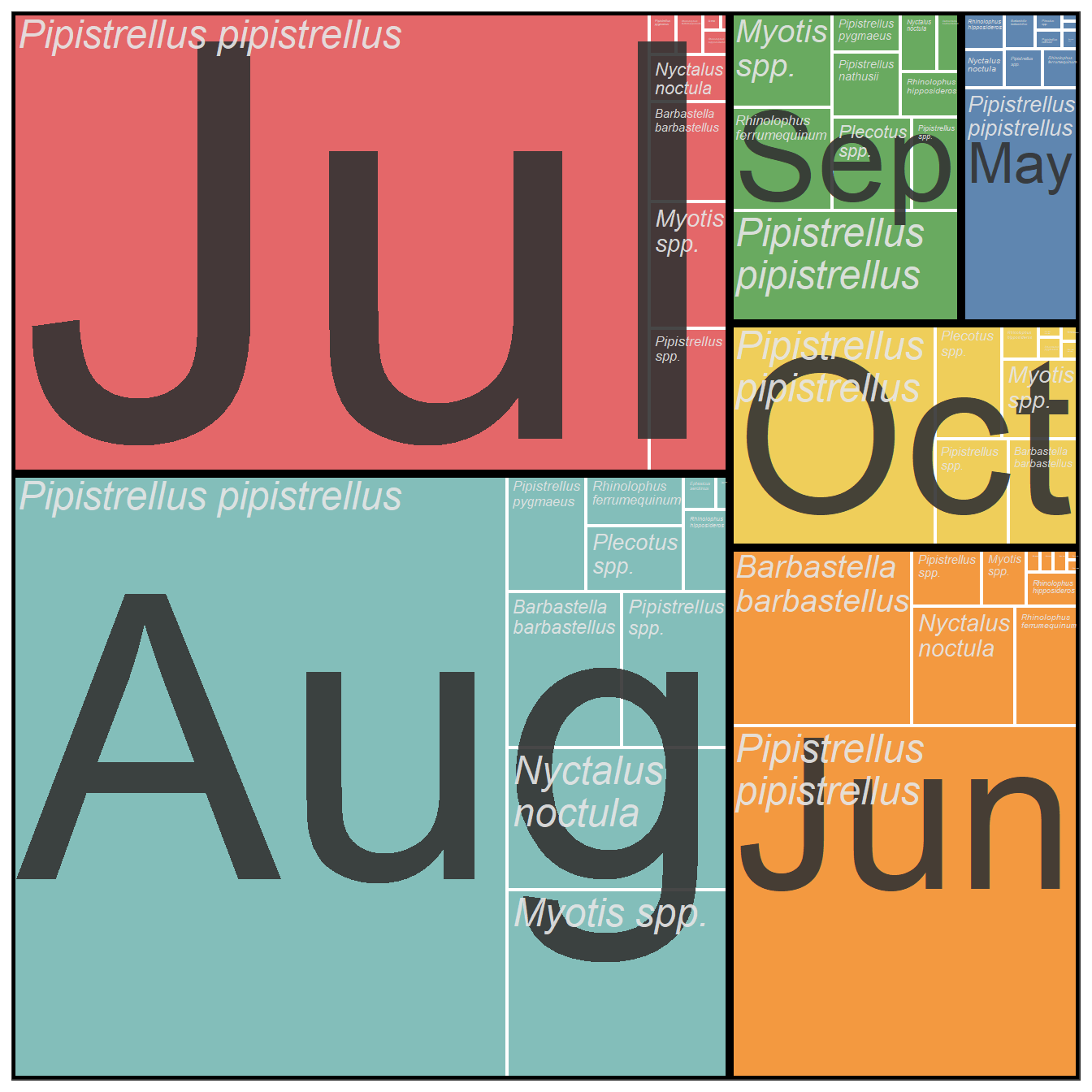
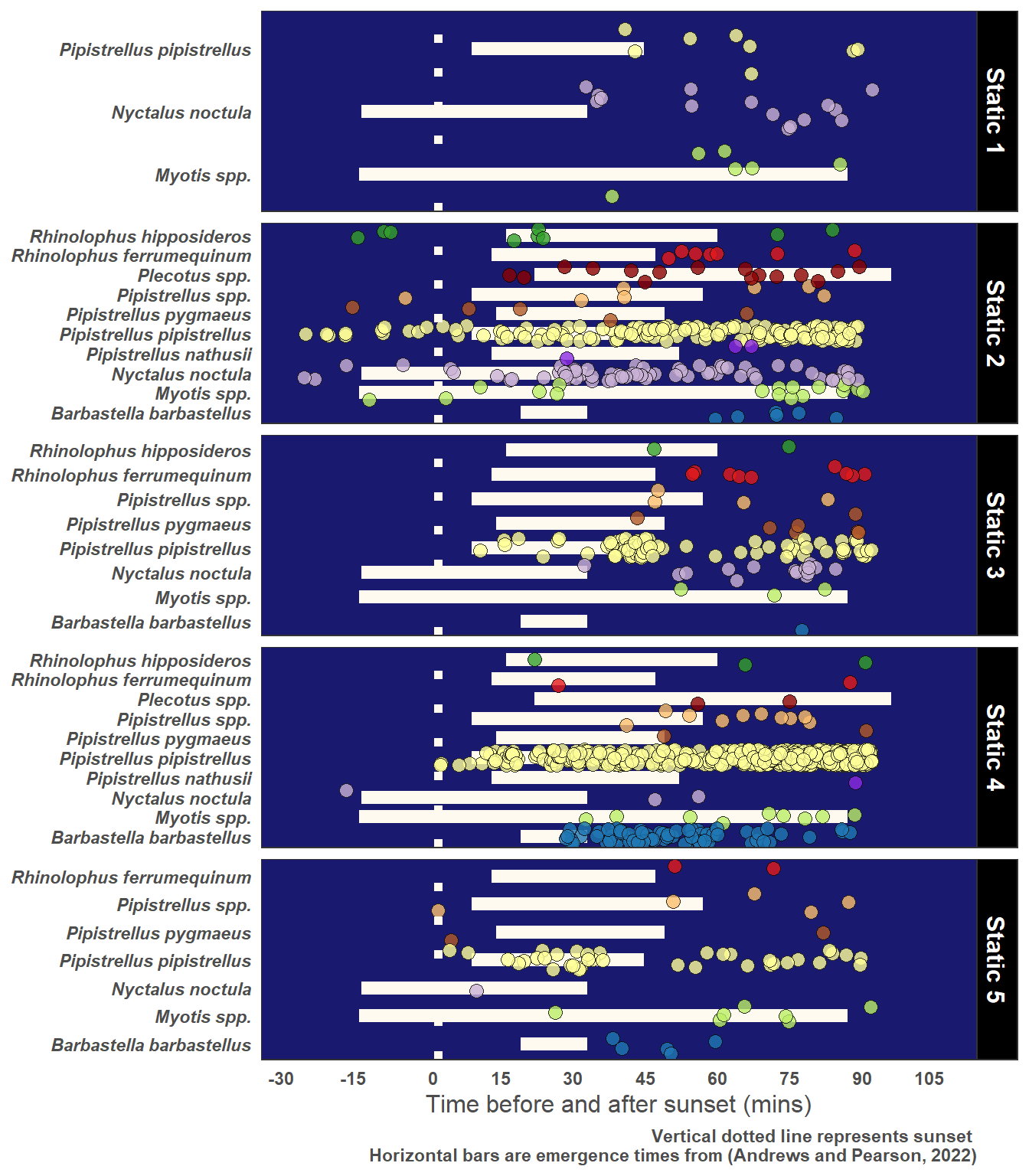
5.5 Identifying Roosts
5.5.1 Evening Bats and Roost Potential
Show the code
# Add data and time information to the statics data using the iBats::date_time_info
statics_plus <- iBats::date_time_info(statics)

# Add sun and night time metrics to the statics data using the iBats::sun_night_metrics() function.
statics_plus <- iBats::sun_night_metrics(statics_plus)

# Add roost emergence times adapted from (Andrews and Pearson, 2022)
statics_plus <- dplyr::left_join(statics_plus, Andrews, by = "Species")

# Graph text
yLab <- "Time before and after sunset (mins)"
Caption <- "Vertical dotted line represents sunset \nHorizontal bars are emergence times from (Andrews and Pearson, 2022)"

# Just choose Observations 90 mins or less after sunset
graph_data <- statics_plus %>%
  filter(post_set_min <= 90)

# colour values used by scale_fill_manual()
graph_bat_colours <- iBats::bat_colours_default(graph_data$Species)

ggplot(graph_data, aes(x = Species, y = post_set_min, fill = Species)) +
  geom_linerange(aes(x = Species, ymin = firstExit95, ymax = lastExit95),
    size = 3, colour = "floralwhite"
  ) +
  geom_jitter(size = 3, alpha = 0.8, shape = 21) +
  geom_hline(yintercept = 0, linetype = "dotted", colour = "floralwhite", linewidth = 2) +
  facet_grid(Description ~ ., scales = "free_y") +
  scale_fill_manual(values = graph_bat_colours) +
  labs(
    y = yLab,
    caption = Caption
  ) +
  scale_y_continuous(breaks = c(-30, -15, 0, 15, 30, 45, 60, 75, 90, 105), limits = c(-30, 105)) +
  coord_flip() +
  theme_bw() +
  theme(
    legend.position = "none",
    plot.caption = element_text(colour = "grey30", face = "bold"), # white
    axis.title.y = element_blank(),
    axis.title.x = element_text(colour = "grey30", size = 12),
    axis.text.x = element_text(hjust = 1, colour = "grey30", face = "bold"),
    axis.text.y = element_text(colour = "grey30", face = "bold.italic"),
    strip.text = element_text(size = 12, face = "bold", colour = "white"), # Bold facet names
    panel.background = element_rect(fill = "midnightblue"),
    panel.grid.major.x = element_line(colour = "transparent", linetype = "dotted"), # grey70
    panel.grid.minor.x = element_blank(),
    panel.grid.major.y = element_blank(),
    panel.grid.minor.y = element_blank(),
    plot.background = element_rect(fill = "transparent"), # grey70
    axis.ticks = element_blank(),
    strip.background = element_rect(fill = "black")
  )
5.5.2 Dawn Bats and Roost Potential
Show the code
# List of bat common names and the scientific names
BatCommon <- c(
  "Barbastella barbastellus" = "Barbastelle",
  "Myotis alcathoe" = "Alcathoe",
  "Myotis bechsteinii" = "Bechstein's",
  "Myotis brandtii" = "Brandt's",
  "Myotis daubentonii" = "Daubenton's",
  "Myotis mystacinus" = "Whiskered",
  "Myotis spp." = "Myotis",
  "Rhinolophus ferrumequinum" = "Greater horseshoe",
  "Rhinolophus hipposideros" = "Lesser horseshoe",
  "Nyctalus leisleri" = "Leisler's",
  "Plecotus auritus" = "Brown long-eared",
  "Plecotus austriacus" = "Grey long-eared",
  "Pipistrellus nathusii" = "Nathusius pipistrelle",
  "Myotis nattereri" = "Natterer's",
  "Nyctalus noctula" = "Noctule",
  "Nyctalus spp." = "Noctule or Leisler's",
  "Eptesicus serotinus" = "Serotine",
  "Pipistrellus pipistrellus" = "Common pipistrelle",
  "Pipistrellus pygmaeus" = "Soprano pipistrelle",
  "Pipistrellus spp." = "Pipistrelle",
  "Plecotus spp." = "Long-eared")

# From Scientific name create a Common Name Vector
statics$Common <-  unname(BatCommon[statics$Species])

# Add data and time information to the statics data using theiBats::date_time_info
statics_plus <- iBats::date_time_info(statics)

# Add sun and night time metrics to the statics data using the iBats::sun_night_metrics() function.
statics_plus <- iBats::sun_night_metrics(statics_plus)

# Add roost emergence times adapted from (Andrews and Pearson, 2022)
statics_plus <- dplyr::left_join(statics_plus, Andrews, by = "Species")

# From Scientific name create a Common Name Vector
statics_plus$Common <-  unname(BatCommon[statics_plus$Species])

# Graph text
yLab <- "Time before and after sunrise (mins)"
Caption <- "Vertical dotted line represents sunrise"

# Just choose Observations 90 mins or less after sunset
graph_data <- statics_plus %>%
  filter(pre_rise_min <= 90) %>%
  mutate(pre_rise_min = pre_rise_min * (-1)) # For correct orientation on the graph

# colour values used by scale_fill_manual()
graph_bat_colours <- iBats::bat_colours(graph_data$Species, colour_vector = bat_colours_sci)

ggplot(graph_data, aes(x = Common, y = pre_rise_min, fill = Species)) +
  geom_jitter(size = 3, alpha = 0.8, shape = 21) +
  geom_hline(yintercept = 0, linetype = "dotted", colour = "floralwhite", linewidth = 2) +
  facet_grid(Description ~ ., scales = "free_y") +
  scale_fill_manual(values = graph_bat_colours) +
  labs(
    y = yLab,
    caption = Caption
  ) +
  scale_y_continuous(breaks = c(-90, -75, -60, -45, -30, -15, 0, 15), limits = c(-90, 15)) +
  coord_flip() +
  theme_bw() +
  theme(
    legend.position = "none",
    plot.caption = element_text(colour = "grey30", face = "bold"), # white
    axis.title.y = element_blank(),
    axis.title.x = element_text(colour = "grey30", size = 12),
    axis.text.x = element_text(hjust = 1, colour = "grey30", face = "bold"),
    axis.text.y = element_text(colour = "grey30", face = "bold.italic"),
    strip.text = element_text(size = 12, face = "bold", colour = "white"), # Bold facet names
    panel.background = element_rect(fill = "midnightblue"),
    panel.grid.major.x = element_line(colour = "transparent", linetype = "dotted"), # grey70
    panel.grid.minor.x = element_blank(),
    panel.grid.major.y = element_blank(),
    panel.grid.minor.y = element_blank(),
    plot.background = element_rect(fill = "transparent"), # grey70
    axis.ticks = element_blank(),
    strip.background = element_rect(fill = "black")
  )
5.6 Standard Graphs
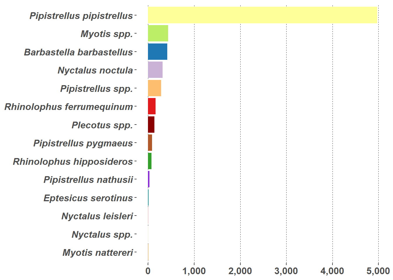
Bar charts (Figure 5.8 (a)) and pie charts (Figure 5.8 (b)) are part of the standard repertoire for reporting bat surveys. These flat graphs can be hard to interpret when there are a large number of variables to display, as in this case with the number of different species in Figure 5.8; and/or a high value, such as the Pipistrellus pipistrellus species in Figure 5.8, that can hide other values. These charts are more effective when they are interactive; example pie chart and bar charts are demonstrated on the Interactive Reports page.
Show the code
graph_data <- statics %>%
  group_by(Species) %>%
  count()

# colour values used by scale_fill_manual()
graph_bat_colours <- iBats::bat_colours_default(graph_data$Species)


g1 <- ggplot(graph_data, aes(x = "", y = n, fill = Species)) +
  geom_bar(width = 1, stat = "identity") +
  coord_polar(theta = "y") +
  scale_fill_manual(values = graph_bat_colours) +
  labs(
    y = "Bat Pass Observations (Nr)",
    fill = "Species"
  ) +
  theme_bw() +
  theme(
    legend.position = "right",
    legend.text = element_text(face = "italic"),
    axis.text.x = element_blank(),
    axis.text.y = element_blank(),
    axis.ticks = element_blank(),
    strip.text = element_blank(),
    axis.title.x = element_blank(),
    axis.title.y = element_blank(),
    panel.grid.major = element_blank(),
    panel.grid.minor = element_blank(),
    panel.background = element_blank(),
    panel.border = element_blank()
  )


g2 <- ggplot(graph_data, aes(x = reorder(Species, n), y = n, fill = Species)) +
  geom_col() +
  scale_y_continuous(label = comma) +
  coord_flip() +
  scale_fill_manual(values = graph_bat_colours) +
  theme_bw() +
  theme(
    legend.position = "none", # No legend
    axis.text.x = element_text(size = 12, angle = 0, face = "bold"),
    axis.text.y = element_text(size = 12, face = "bold.italic"), # bat names italic
    axis.title.y = element_blank(), # no y title (just bat names)
    axis.title.x = element_blank(), # no x title
    panel.grid.major = element_blank(), # remove grid lines
    panel.grid.minor = element_blank(),
    panel.border = element_blank(),
    panel.grid.major.x = element_line(colour = "grey20", linewidth = 0.1, linetype = "dashed")
  )

g1
g2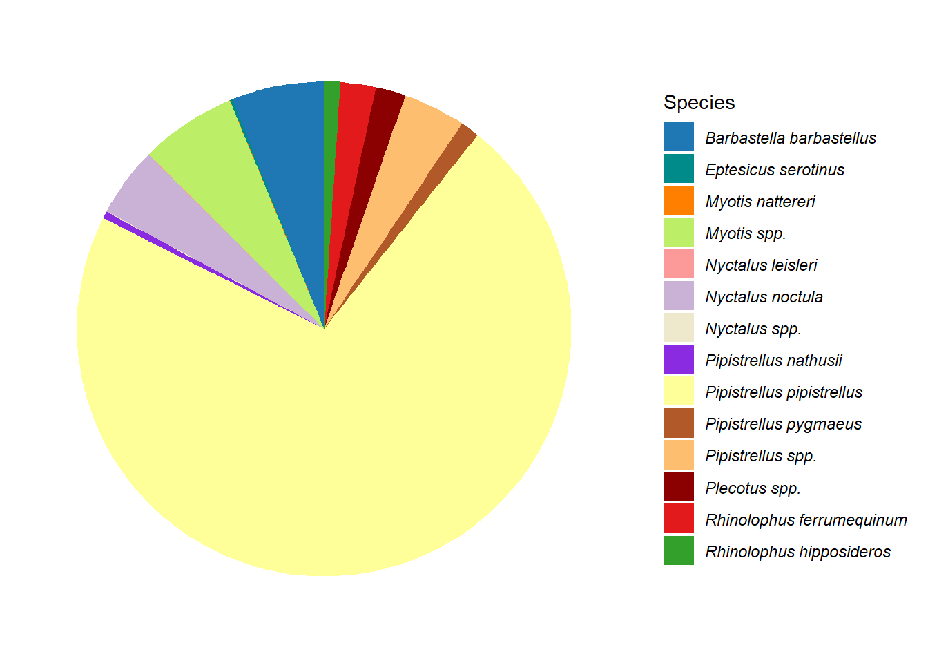
David Cornwell (John le Carré), The Honourable Schoolboy (1977)↩︎